Explaining Forecasting Models with SHAP#
Why did the model predict a spike tomorrow morning? Which lagged values mattered most? How do covariates shape the forecast?
Darts’ ShapExplainer answers these questions using SHAP (SHapley Additive exPlanations) [1], a game-theoretic framework that attributes each input feature’s contribution to a prediction. It works with any of Darts’ scikit-learn-like [2] and PyTorch [3] models through a single, unified API.
What you will learn:
3. Global Explainability : which features matter most overall
4. Local Explainability : why the model made a specific prediction
5. Probabilistic explainability : explaining quantile forecasts
We use the ElectricityConsumptionZurichDataset throughout, keeping the data small for fast computation.
[1] Lundberg & Lee, A Unified Approach to Interpreting Model Predictions, NeurIPS 2017.
[2] Models such as
SKLearnModel,LinearRegressionModel,LightGBMModel, …[3] Regular neural network models such as
TiDEModeland foundation models such asChronos2Model, …
1. Setup and Data Preparation#
[1]:
%load_ext autoreload
%autoreload 2
%matplotlib inline
[2]:
import logging
import warnings
import numpy as np
import plotly
import shap
from darts import concatenate, set_option
from darts.datasets import ElectricityConsumptionZurichDataset
from darts.explainability import ShapExplainer
from darts.metrics import mae, mic, miw
from darts.models import DLinearModel, LinearRegressionModel
from darts.utils.likelihood_models import QuantileRegression
from darts.utils.timeseries_generation import datetime_attribute_timeseries
warnings.filterwarnings("ignore")
logging.disable(logging.CRITICAL)
set_option("plotting.use_darts_style", True)
plotly.offline.init_notebook_mode()
shap.initjs()

We load hourly electricity consumption for Zurich households & SMEs, using the last four weeks (three for training, one for testing). Also, let’s use calendar features “hour” and “dayofweek” as future covariates.
[3]:
data = ElectricityConsumptionZurichDataset().load().astype("float32")
data = data.resample("h", method="sum")[-28 * 24 - 1 : -1]
series = data["Value_NE5"].with_columns_renamed("Value_NE5", "consumption")
future_covariates = (
datetime_attribute_timeseries(
time_index=series,
attribute="hour",
add_length=24,
)
.add_datetime_attribute("dayofweek")
.astype("float32")
)
train, test = series[: -24 * 7], series[-24 * 7 :]
[4]:
fig = train.plotly(label="train")
test.plotly(label="test", fig=fig)
fig.update_layout(yaxis_title="Consumption (MWh)", autosize=True)
2. Train Two Models#
We train a LinearRegressionModel (scikit-learn) and a DLinearModel (PyTorch) to forecast the next 24 hours. Both use the same inputs:
Target lags: past 24 hours of consumption.
Future covariates: next 24 hours of hour-of-day, and day-of-week.
[5]:
sklearn_model = LinearRegressionModel(
lags=24,
lags_future_covariates=(0, 24),
output_chunk_length=24,
random_state=42,
).fit(train, future_covariates=future_covariates)
torch_model = DLinearModel(
input_chunk_length=24,
output_chunk_length=24,
random_state=42,
).fit(train, future_covariates=future_covariates)
Quick Evaluation#
A rolling 24-hour-ahead historical forecast over the test set confirms both models produce reasonable predictions. This notebook focuses on explainability, so we keep evaluation brief.
[6]:
hfc_kwargs = dict(
series=series,
future_covariates=future_covariates,
start=test.start_time(),
forecast_horizon=24,
stride=24,
retrain=False,
last_points_only=False,
)
sklearn_pred = concatenate(sklearn_model.historical_forecasts(**hfc_kwargs))
torch_pred = concatenate(torch_model.historical_forecasts(**hfc_kwargs))
fig = test.plotly(label="actual")
sklearn_pred.plotly(
label=f"LinearRegression (MAE: {mae(test, sklearn_pred):.2f})", fig=fig
)
torch_pred.plotly(label=f"DLinear (MAE: {mae(test, torch_pred):.2f})", fig=fig)
fig.update_layout(yaxis_title="Consumption (MWh)", autosize=True)
3. Global Explainability#
Global explanations reveal which features are most important overall across many forecasts. We initialize a ShapExplainer with:
model: the fitted forecasting model.background_series: reference data used to compute the SHAP baseline prediction. Defaults to the training data if omitted.
By default, ShapExplainer selects the most appropriate SHAP method for the model type (e.g. "linear" for linear regression, "permutation" for PyTorch models). You can override this via the shap_method parameter.
[7]:
sklearn_explainer = ShapExplainer(
model=sklearn_model,
background_series=test,
background_future_covariates=future_covariates,
)
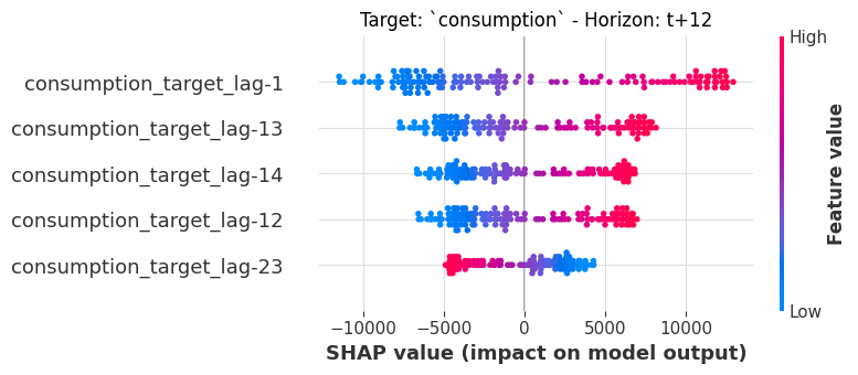
3.1 Summary Beeswarm Plot#
The beeswarm (or “dot”) plot shows every forecast instance as a dot, colored by the raw feature value. Features are sorted by mean absolute SHAP value (most important at top).
We inspect the 12-hour-ahead horizon:
[8]:
sklearn_explainer.summary_plot(horizons=[12], plot_kwargs=dict(max_display=10));
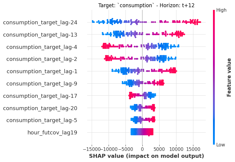
Target lags dominate, meaning that past consumption is the strongest predictor of future consumption. The color gradient shows how feature values correlate with their SHAP contributions: for example, higher values of recent consumption lags push the forecast up (red dots on the right).
3.2 Summary Bar Plot#
A bar plot gives a cleaner ranking of mean |SHAP| importance. Let’s compare two horizons 12h and 24h ahead:
[9]:
sklearn_explainer.summary_plot(
horizons=[12, 24], plot_type="bar", plot_kwargs=dict(max_display=5)
);
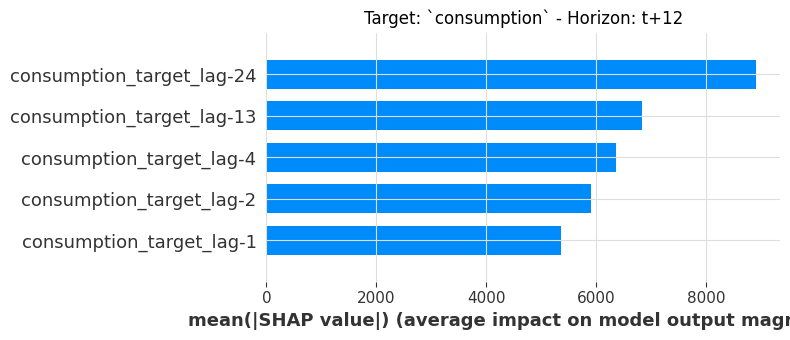
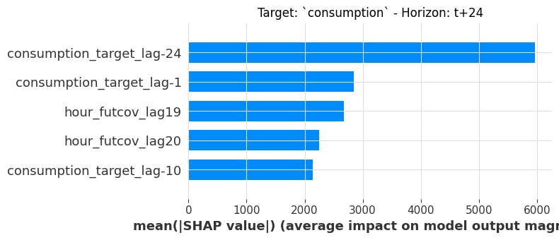
Notice how the ranking shifts between horizons: some lags matter more for shorter horizons, while others gain importance at 24h. This is a natural consequence of multi-horizon forecasting.
3.3 Dependence Plot#
To see how a single feature’s value relates to its SHAP contribution, we extract the shap.Explanation object and use shap.plots.scatter. Because LinearRegressionModel is linear, we expect a clean linear relationship:
[10]:
result = sklearn_explainer.explain()
shap_object = result.get_shap_explanation_object(horizon=12)
shap.plots.scatter(shap_object[:, "consumption_target_lag-13"])
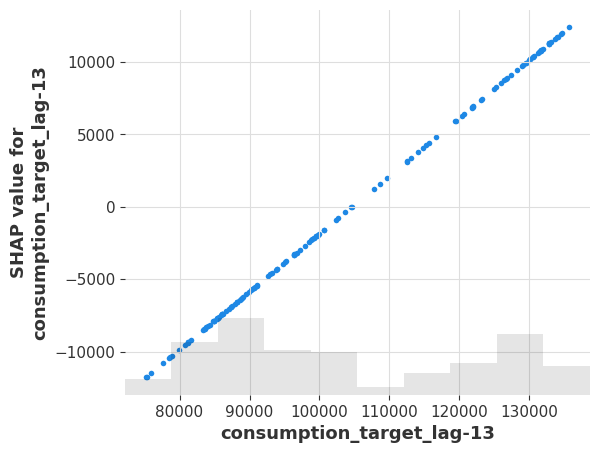
The linear relationship confirms the model’s structure: lag -13 is exactly one 24 hours before horizon=12 (lag=11), so the model learns a strong daily-seasonality coefficient.
3.4 Same API for PyTorch Models#
The ShapExplainer API is identical for PyTorch models. Let’s create an explainer for DLinearModel and produce a summary plot at the same horizon:
[11]:
torch_explainer = ShapExplainer(
model=torch_model,
background_series=test,
background_future_covariates=future_covariates,
batch_size=4096,
)
torch_explainer.summary_plot(horizons=[12], plot_kwargs=dict(max_display=5));
The DLinear model also relies heavily on target lags - but the distribution of SHAP values is different from the linear model, reflecting the different model architecture. The API calls are identical: just swap the model.
4. Local Explainability#
Local explanations answer: why did the model make this specific prediction?
We use the sklearn model for local explanations (the API is the same for torch models).
4.1 Computing SHAP Values#
The .explain() method computes SHAP values for all forecastable timestamps in the foreground series, returning a ShapExplainabilityResult:
[12]:
result = sklearn_explainer.explain(
foreground_series=test,
foreground_future_covariates=future_covariates,
)
The result object provides three accessors:
Method |
Returns |
|---|---|
|
|
|
|
|
Raw |
Let’s inspect the SHAP values at the 12-hour horizon:
[13]:
result.get_explanation(horizon=12)
[13]:
| consumption_target_lag-24 | consumption_target_lag-23 | consumption_target_lag-22 | consumption_target_lag-21 | consumption_target_lag-20 | ... | dayofweek_futcov_lag21 | hour_futcov_lag22 | dayofweek_futcov_lag22 | hour_futcov_lag23 | dayofweek_futcov_lag23 | |
|---|---|---|---|---|---|---|---|---|---|---|---|
| 2022-08-25 00:00:00 | -10379.894531 | 2148.450439 | -2.689489 | 532.226379 | -281.067688 | ... | -14.348060 | 153.506866 | -3.887789 | -442.714478 | -8.456299 |
| 2022-08-25 01:00:00 | -12328.749023 | 2048.898438 | -2.099411 | 58.013622 | 1131.847046 | ... | -14.348060 | 167.893631 | -3.887789 | 432.817169 | -177.582428 |
| 2022-08-25 02:00:00 | -11750.551758 | 1589.196167 | -0.198098 | -288.357758 | 1926.117310 | ... | -14.348060 | -163.002121 | -198.277420 | 394.750580 | -177.582428 |
| 2022-08-25 03:00:00 | -9080.606445 | 107.973320 | 1.190647 | -483.070465 | 2247.932861 | ... | -219.320526 | -148.615356 | -198.277420 | 356.683960 | -177.582428 |
| 2022-08-25 04:00:00 | -477.680511 | -973.931763 | 1.971330 | -561.962463 | 2723.159912 | ... | -219.320526 | -134.228577 | -198.277420 | 318.617371 | -177.582428 |
| ... | ... | ... | ... | ... | ... | ... | ... | ... | ... | ... | ... |
| 2022-08-30 20:00:00 | -3280.172363 | 899.971313 | -1.236710 | 467.921997 | -2239.091064 | ... | 190.624420 | 95.959770 | 190.501846 | -290.448120 | 160.669830 |
| 2022-08-30 21:00:00 | -5077.596191 | 917.106873 | -1.841588 | 538.016541 | -2383.853027 | ... | 190.624420 | 110.346542 | 190.501846 | -328.514709 | 160.669830 |
| 2022-08-30 22:00:00 | -5177.119141 | 1388.338867 | -2.122626 | 573.504517 | -2409.126221 | ... | 190.624420 | 124.733315 | 190.501846 | -366.581299 | 160.669830 |
| 2022-08-30 23:00:00 | -7914.029297 | 1607.282104 | -2.264912 | 579.700073 | -1911.726196 | ... | 190.624420 | 139.120087 | 190.501846 | -404.647888 | 160.669830 |
| 2022-08-31 00:00:00 | -9185.649414 | 1718.130127 | -2.289752 | 457.764160 | -212.922882 | ... | 190.624420 | 153.506866 | 190.501846 | -442.714478 | 160.669830 |
shape: (145, 72, 1), freq: h, size: 40.78 KB
Each row is a forecast start time; each column is a feature’s SHAP contribution to the 12-hour-ahead prediction. There are 72 input features in total: 24 target lags, plus 24 lags each for the three future covariate components (hour, dayofweek).
4.2 Waterfall Plot#
A waterfall plot is the most intuitive way to see why a single prediction was made. Starting from the baseline (average prediction), each feature adds or subtracts from the final predicted value:
[14]:
shap_object = result.get_shap_explanation_object(horizon=12)
shap.plots.waterfall(shap_object[0])
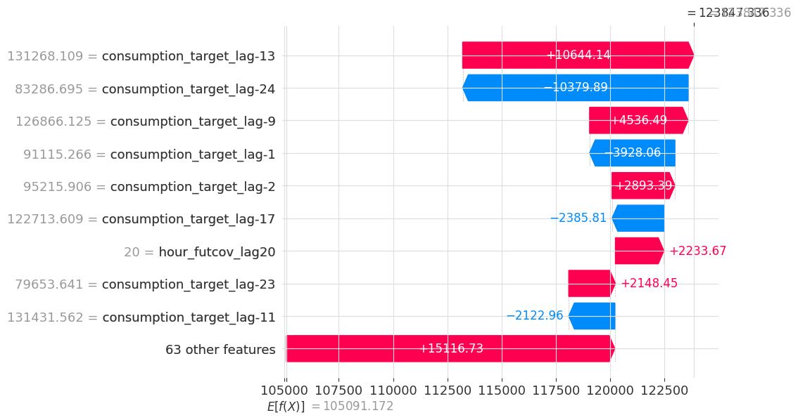
The model starts at E[f(x)] (baseline), then each feature pushes the prediction up (red) or down (blue), arriving at f(x) - the actual predicted value. Target lags dominate this particular prediction.
4.3 Force Plot#
The force plot is an interactive alternative that shows the same additive decomposition in a compact horizontal layout. Select “original sample ordering” in the interactive toolbar on top to show forecast timestamps chronologically:
[15]:
sklearn_explainer.force_plot(
foreground_series=test,
foreground_future_covariates=future_covariates,
horizon=12,
)
[15]:
Have you run `initjs()` in this notebook? If this notebook was from another user you must also trust this notebook (File -> Trust notebook). If you are viewing this notebook on github the Javascript has been stripped for security. If you are using JupyterLab this error is because a JupyterLab extension has not yet been written.
Red regions push the prediction above the baseline; blue regions pull it below. Hovering over a region reveals the contributing features and their values.
4.4 Explaining a Single Forecast#
When you only care about one specific prediction (e.g. the actual model forecast), .explain_single() is more efficient than .explain(), as it computes SHAP values for just that one forecast across all horizons. This explains the forecast generated by calling model.predict(n=24, series=...).
[16]:
result_single = sklearn_explainer.explain_single(
foreground_series=test,
foreground_future_covariates=future_covariates,
)
print("Test set end time:", test.end_time())
result_single.get_explanation()
Test set end time: 2022-08-30 23:00:00
[16]:
| consumption_target_lag-24 | consumption_target_lag-23 | consumption_target_lag-22 | consumption_target_lag-21 | consumption_target_lag-20 | ... | dayofweek_futcov_lag21 | hour_futcov_lag22 | dayofweek_futcov_lag22 | hour_futcov_lag23 | dayofweek_futcov_lag23 | |
|---|---|---|---|---|---|---|---|---|---|---|---|
| 2022-08-31 00:00:00 | -106.176033 | -2581.511963 | 1692.701782 | 2070.556885 | -270.833435 | ... | 13.682087 | -943.732361 | 12.682373 | -569.508179 | 9.638122 |
| 2022-08-31 01:00:00 | 3936.019287 | -9164.561523 | 588.513000 | 3805.863281 | -82.457878 | ... | 16.302183 | -2153.395020 | 18.264908 | -1933.486938 | 9.143848 |
| 2022-08-31 02:00:00 | 907.882080 | -594.693359 | -7568.899902 | 3586.885986 | 55.325130 | ... | 18.259106 | -2947.022949 | 24.863527 | -3413.346924 | 10.468850 |
| 2022-08-31 03:00:00 | -3093.964111 | 1685.322266 | -144.382187 | -2340.815430 | -41.063385 | ... | 25.609144 | -2990.720459 | 35.415722 | -4281.487793 | 19.503969 |
| 2022-08-31 04:00:00 | -4849.722168 | 102.794174 | 1404.632446 | 3677.335938 | -750.013672 | ... | 36.911377 | -2338.827148 | 46.718651 | -4185.157715 | 32.783611 |
| ... | ... | ... | ... | ... | ... | ... | ... | ... | ... | ... | ... |
| 2022-08-31 19:00:00 | 4591.011719 | 731.986877 | -259.273438 | -1857.692993 | 118.767563 | ... | 186.558899 | 1713.976440 | 176.009476 | 2282.935059 | 151.773544 |
| 2022-08-31 20:00:00 | 5599.786133 | -248.086975 | 1380.527588 | -2292.551025 | -23.829096 | ... | 174.183365 | 1322.323608 | 164.254425 | 2094.097168 | 142.380859 |
| 2022-08-31 21:00:00 | 6806.327637 | -1419.354736 | 1527.216797 | -1237.050293 | -96.863815 | ... | 168.595703 | 1044.313354 | 158.792480 | 1799.267090 | 139.620987 |
| 2022-08-31 22:00:00 | 7623.354980 | -1417.829590 | 788.297424 | -1198.392090 | 21.118551 | ... | 167.128998 | 1050.255005 | 157.198898 | 1600.380859 | 141.915787 |
| 2022-08-31 23:00:00 | 6147.047852 | 1602.511841 | -190.753265 | -1160.363892 | -24.619184 | ... | 168.154938 | 871.813843 | 157.211441 | 1456.708130 | 145.764175 |
shape: (24, 72, 1), freq: h, size: 6.75 KB
The result is a TimeSeries where each row is a forecast horizon (t+1 through t+24) and each column is a feature’s SHAP contribution at that horizon.
We see that the first row is one hour ahead of the end time of the test set, confirming that we’re looking at the forecast of the test set.
4.5 Heatmap Across Horizons#
The heatmap is a powerful visualization unique to multi-horizon forecasting: it shows how feature importance evolves across the forecast horizon. The top panel shows the predicted values; the bottom panel shows SHAP contributions of the top features at each horizon:
[17]:
shap_object = result_single.get_shap_explanation_object()
ax = shap.plots.heatmap(
shap_object,
instance_order=np.arange(shap_object.shape[0]),
show=False,
)
ax.set_xlabel("Horizon lag (0 is the first forecasted step)");
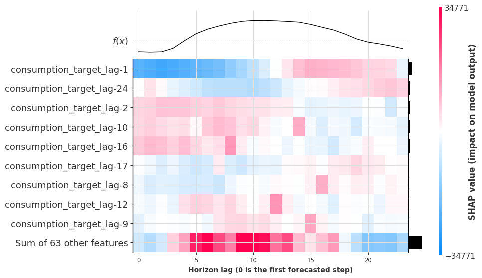
A clear pattern emerges: many target lags have peak influence at horizon lag = lag + 24, revealing that the model has learned a daily seasonality pattern. For instance, lag-10 matters most at horizon lag 14 (-10 + 24 = 14), because 24 hours ago is the same time of day.
5. Probabilistic Explainability#
ShapExplainer can also explain the likelihood parameters of probabilistic forecasts.
For PyTorch models: All likelihoods are supported (e.g.,
QuantileRegression,GaussianLikelihood, …).For scikit-learn-like models: Quantile and poisson regression are supported.
For example, with quantile regression, SHAP values are computed for each predicted quantile - letting you understand what drives not just the median forecast, but also the model’s uncertainty bounds.
5.1 Train a Probabilistic Model#
[18]:
prob_model = DLinearModel(
input_chunk_length=24,
output_chunk_length=24,
likelihood=QuantileRegression(quantiles=[0.1, 0.5, 0.9]),
random_state=42,
).fit(train, future_covariates=future_covariates)
5.2 Quick Evaluation#
We evaluate the prediction intervals using Mean Interval Coverage (MIC) and Mean Interval Width (MIW):
[19]:
prob_preds = prob_model.historical_forecasts(
predict_likelihood_parameters=True, **hfc_kwargs
)
prob_pred = concatenate(prob_preds)
mic_val = mic(test, prob_pred, q_interval=(0.1, 0.9))
miw_val = miw(test, prob_pred, q_interval=(0.1, 0.9))
print(f"MIC (target ~80%): {mic_val:.1%} | MIW: {miw_val:.2f}")
fig = test.plotly(label="actual")
prob_pred.plotly(fig=fig)
fig.update_layout(yaxis_title="Consumption (MWh)", autosize=True)
MIC (target ~80%): 79.2% | MIW: 25663.69
The three forecasted components correspond to the quantiles: consumption_q0.100, consumption_q0.500, and consumption_q0.900.
5.3 Explaining Quantile Forecasts#
We create an explainer and use .explain_single() to compute SHAP values for the last day’s forecast. We can then inspect any quantile by specifying the component:
[20]:
prob_explainer = ShapExplainer(
model=prob_model,
background_series=test,
background_future_covariates=future_covariates,
batch_size=4096,
)
result_single = prob_explainer.explain_single(
foreground_series=test,
foreground_future_covariates=future_covariates,
)
5.4 Heatmap for the Upper Bound (q=0.9)#
Let’s visualize what features drive the 90th percentile - the upper bound of the prediction interval:
[21]:
shap_object = result_single.get_shap_explanation_object(component="consumption_q0.900")
ax = shap.plots.heatmap(
shap_object,
instance_order=np.arange(shap_object.shape[0]),
show=False,
)
ax.set_xlabel("Horizon lag (0 is the first forecasted step)");
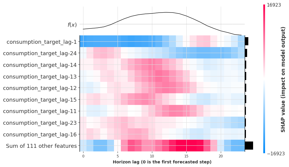
The upper-bound forecast is driven by many of the same target lags, but with different magnitudes and patterns compared to the point forecast. Lags like lag-14 and lag-13 show strong influence at the lag + 24 horizon, confirming the model learns daily seasonality for the uncertainty bounds too.
Conclusion#
In this notebook we demonstrated Darts’ ShapExplainer to:
Explain any Darts scikit-learn and PyTorch model through a single, unified API.
Global explanations: identify which features matter most across many forecasts (beeswarm, bar, dependence plots).
Local explanations: understand individual predictions (waterfall, force plot) and how feature importance evolves across the forecast horizon (heatmap).
Probabilistic explanations: explain predicted quantiles to understand what drives uncertainty bounds.
Further reading:
[ ]: